Color is a core element of any brand. Brand recognition can be increased by up to 80% through just color alone.
There is a strong correlation between brand recognition and consistency in color. Our colors say a lot about who we are. They help identify us at a glance, and set the tone for our communications, from bold and powerful, to inspirational and passionate.
Primary Palette
Instantly recognizable as Pennsylvania Highlands Community College, our core colors should dominate all communications.
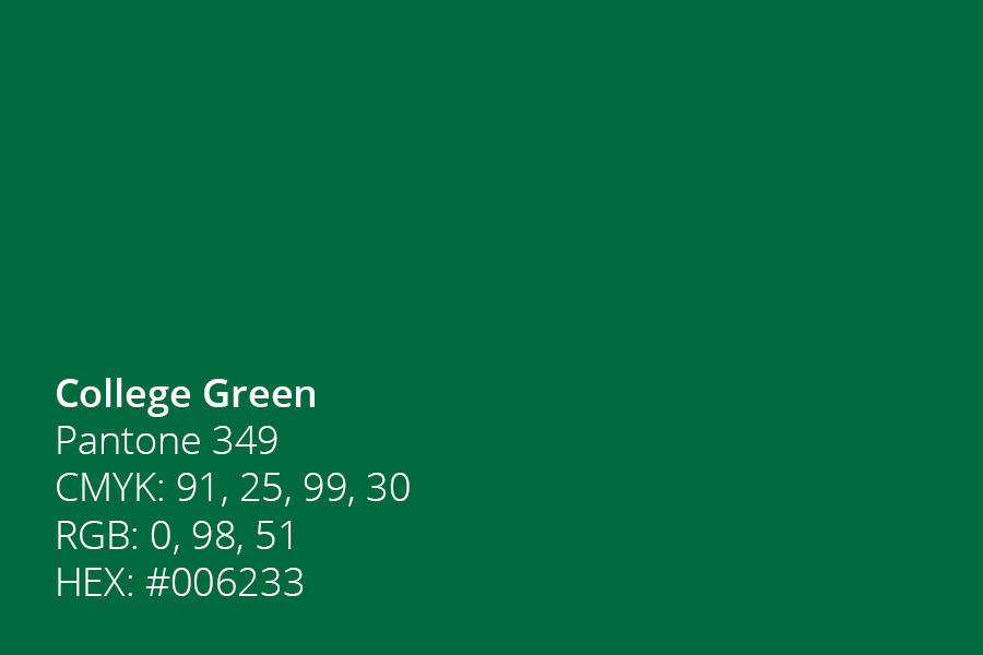
College Green
Pantone 349
CMYK: 91, 25, 99, 30
RGB: 0, 98, 51
HEX: #006233
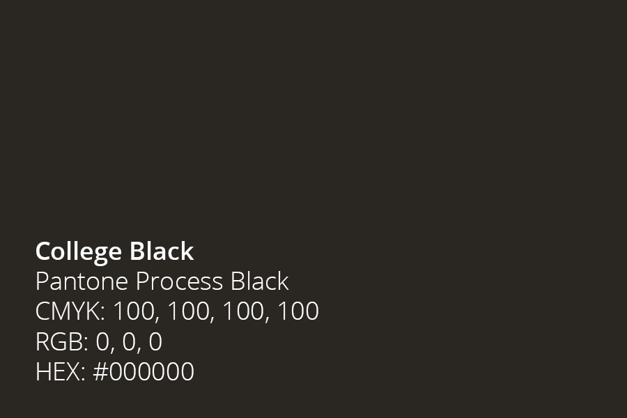
College Black
Pantone Process Black
CMYK: 100, 100, 100, 100
RGB: 0, 0, 0
HEX: #000000
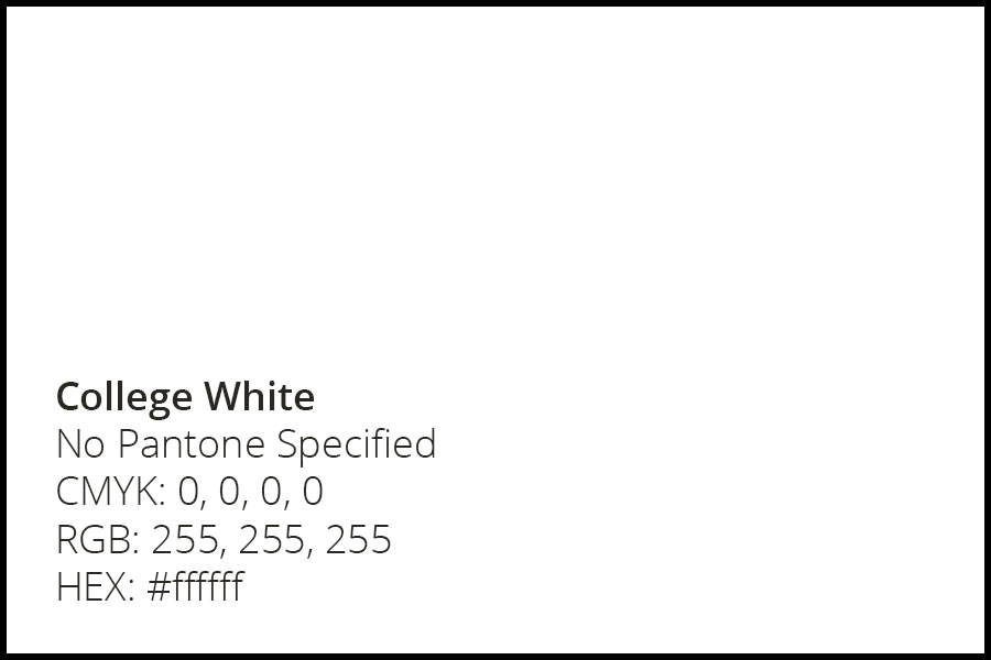
College White
No Pantone Specified
CMYK: 0, 0, 0, 0
RGB: 255, 255, 255
HEX: #ffffff
Secondary Palette
Our secondary palette is a perfect complement to our primary colors, and can also appear separate from the primary palette in specific instances.
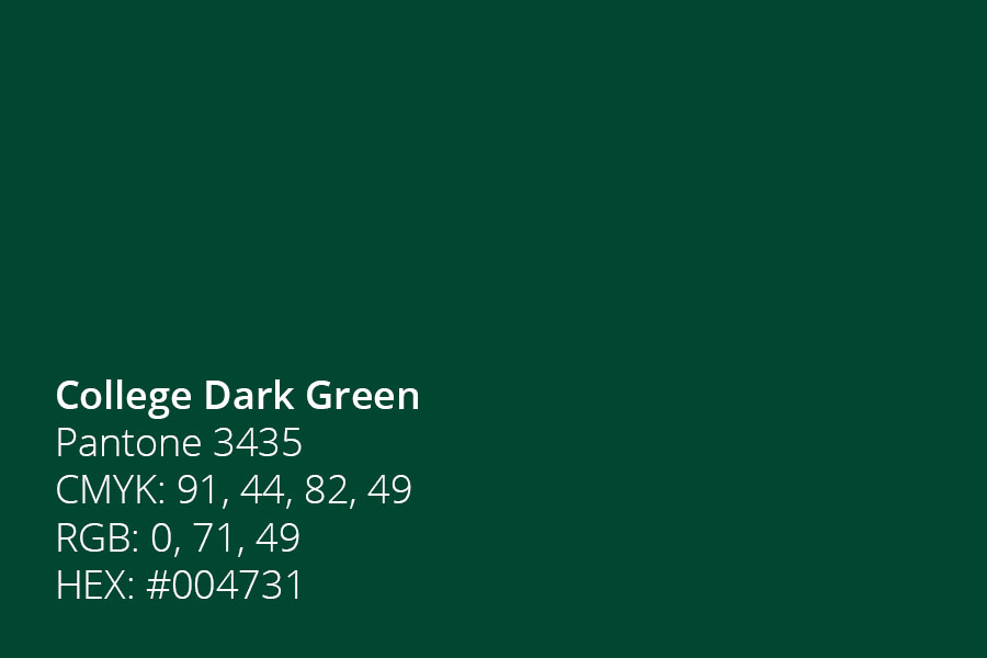
College Dark Green
Pantone 3435
CMYK: 91, 44, 82, 49
RGB: 0, 71, 49
HEX: #004731
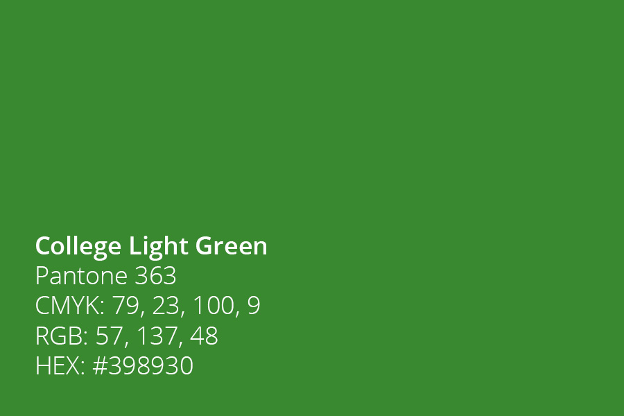
College Light Green
Pantone 363
CMYK: 79, 23, 100, 9
RGB: 57, 137, 48
HEX: #398930
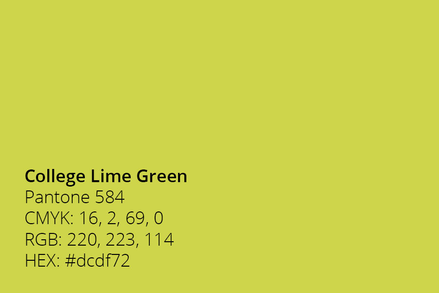
College Lime Green
Pantone 584
CMYK: 16, 2, 69, 0
RGB: 220, 223, 114
HEX: #dcdf72
Accent Palette
Our accent palette adds balance and flexibility to all communications, while keeping the brand fresh for internal and external audiences. They are generally intended to accent our primary and secondary palette, and should appear separate from our primary colors in a select few communications.
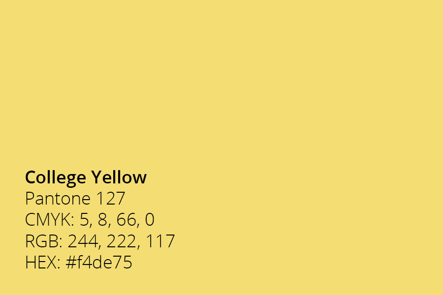
College Yellow
Pantone 127
CMYK: 5, 8, 66, 0
RGB: 244, 222, 117
HEX: #f4de75
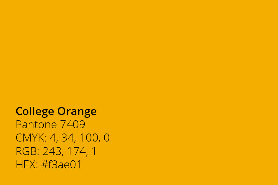
College Orange
Pantone 7409
CMYK: 4, 34, 100, 0
RGB: 243, 174, 1
HEX: #f3ae01
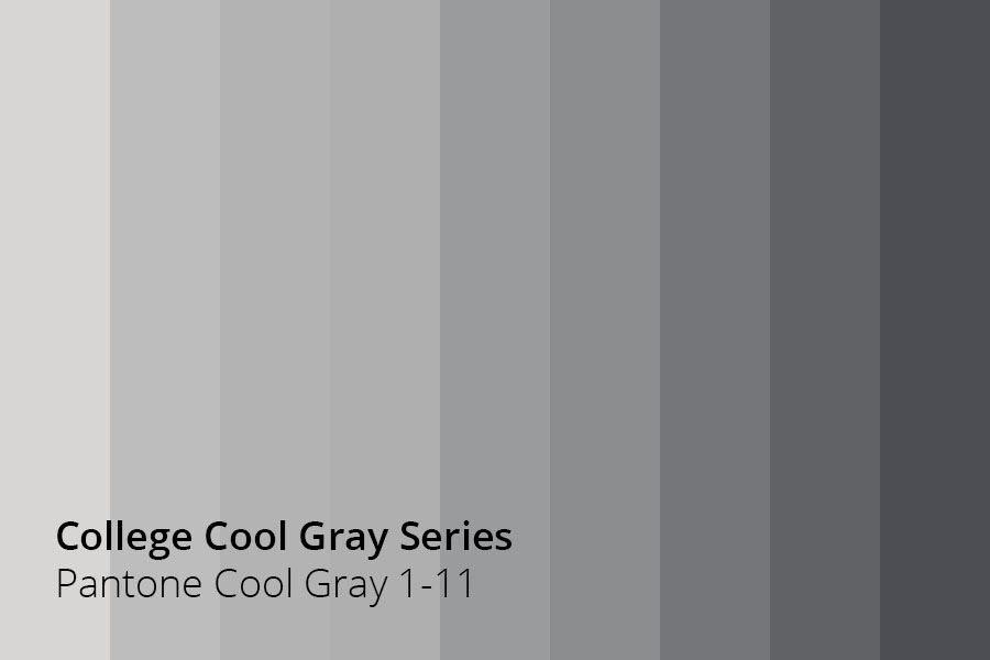
College Cool Gray Series
Pantone Cool Gray 1-11
CMYK: TBD
RGB: TBD
HEX: TBD
